

Franklin Middle School's principal spent $47,000 on a new analytics platform last year. Six months later? Teachers still track attendance on paper spreadsheets, the board gets the same static PDF reports they've received for a decade, and the expensive dashboard displays real-time data that nobody actually uses to make decisions.
This happens everywhere. Most schools buy analytics systems backwards—they start with the technology, then try to figure out what to measure, then wonder why nothing improves.
After working with dozens of districts on their data operations, the pattern is clear: schools fail at performance analytics not because they lack data, but because they build reporting systems that serve nobody well. The superintendent wants strategic insights but gets operational minutiae. Teachers need actionable classroom data but receive district-wide averages. Board members request accountability metrics but get buried in educational jargon.
The stakeholder disconnect that kills most analytics initiatives
School analytics fail when you treat all users like they want the same information. They don't.
Board members care about graduation rates trending over five years and budget efficiency ratios. They're comparing your district to neighboring ones, watching state funding formulas, and answering to taxpayers about ROI on education spending. Showing them daily attendance fluctuations or individual teacher performance metrics wastes their time and erodes trust in your data systems.
Teachers need completely different intelligence. They care about which students missed three days this week, not district-wide chronic absenteeism rates. They need to know that Johnny's reading scores dropped after his parents' divorce, not that Grade 4 reading averages improved 2.3% year-over-year. Their dashboards should flag intervention opportunities, not celebrate institutional achievements.
Administrators sit in the messy middle. They translate between classroom reality and boardroom strategy, which means they need both granular operational data and rolled-up performance indicators. Most analytics platforms force them to choose one or the other.
What usually happens: districts buy one-size-fits-all platforms, customize nothing, then wonder why adoption rates stay below 20%. Teachers abandon the system within weeks because it doesn't help their daily work. Board members request custom reports because the standard dashboards don't answer their questions. Administrators spend hours manually creating presentations that bridge the gap between what the system provides and what stakeholders actually need.
The vendors selling these platforms know this problem exists. But instead of building role-based analytics, they add more features, more visualizations, more complexity. Schools end up with Swiss Army knife solutions when they need specialized tools for specific jobs.
Why traditional KPI frameworks break in education
Corporate KPI models assume clear profit motives and measurable outputs. Education doesn't work that way.
Eliminate administrative overload.
GoSkoly helps you manage schedules, attendance, and communications seamlessly.
- Unified student and staff management
- Automated attendance tracking
- Integrated communication tools
No credit card required
Take student achievement—the most obvious education metric. Should you measure standardized test scores? Grade progression? College acceptance rates? Post-graduation employment? Each metric tells a different story, serves different stakeholders, and drives different behaviors.
Pick test scores as your primary KPI, and teachers start teaching to the test. Choose college acceptance rates, and vocational programs get defunded. Focus on graduation rates, and grade inflation becomes endemic. Every metric creates its own distortion field.
Education KPIs have different time horizons that don't align with reporting cycles. Academic growth happens over semesters and years. Behavioral interventions show results in weeks or months. Attendance patterns emerge daily but only matter when they become chronic. Budget impacts unfold across fiscal years that don't match academic calendars.
Most schools try to solve this by measuring everything. They track hundreds of metrics across dozens of systems, generating thousands of data points that nobody synthesizes into actionable intelligence. Data exists everywhere, insights exist nowhere.
Districts with 47 different "critical" KPIs in their strategic plans aren't uncommon. When everything is critical, nothing is. Teachers ignore the dashboards because they can't possibly act on that much information. Administrators cherry-pick whatever metrics support their current initiatives. Board members get lost in the noise and default to asking about test scores—the one metric they understand.
The successful districts pick 5-7 KPIs that cascade properly through organizational levels. The board might track graduation rates. Administrators monitor credit completion rates that feed graduation. Teachers watch assignment completion that drives credit completion. Same strategic goal, different operational metrics at each level.
Building dashboard wireframes that people actually use
Functional dashboards follow user workflows, not data structures.
A teacher's morning routine: check attendance, review yesterday's assignment submissions, identify struggling students, plan interventions. Their dashboard should mirror this workflow—attendance flags at the top, missing work alerts next, performance trend warnings below that. Not a grid of charts showing school-wide metrics they can't influence.
Priority Alerts Section (top of screen):
-
Red flags
Students absent 3+ days this week
-
Yellow warnings
Assignment completion below 70%
-
Intervention needed
Grade dropped full letter in past two weeks
-
Parent contact required
Behavioral incidents logged
My Classroom Performance (middle):
-
Current unit mastery rates by student
-
Assignment submission tracker for this week
-
Quick comparison to other sections I teach
-
Link to drill down on any struggling student
Action Tools (sidebar):
-
Generate intervention plans
-
Schedule parent conferences
-
Request specialist support
-
Export progress reports
Notice what's missing? School-wide data. District comparisons. Historical trends beyond two weeks. Teachers don't need that information to do their job today.
Administrator dashboards look completely different:
Operational Health (main view):
-
Teacher coverage gaps for this week
-
Substitute fill rates and costs
-
Critical resource shortages flagged
-
Special education compliance warnings
Academic Pulse (tabbed view):
-
Grade-level performance vs. targets
-
Department comparison matrices
-
Student movement between performance tiers
-
Intervention program effectiveness rates
Strategic Indicators (quarterly update):
-
Progress toward annual goals
-
Budget burn rate vs. academic calendar
-
Staffing pipeline health
-
State reporting requirement status
Board dashboards need even higher altitude:
| Strategic Scorecard | Financial Sustainability | Stakeholder Confidence |
|---|---|---|
| Multi-year graduation rate trends | Revenue per student trends | Parent satisfaction scores |
| Cost per student vs. regional average | Fixed vs. variable cost ratios | Teacher retention rates |
| Achievement gap closure progress | Facility utilization rates | Community partnership growth |
| College/career readiness indicators | Long-term obligation coverage | Student engagement indices |
Each dashboard serves its audience's decision-making needs. Teachers make dozens of micro-decisions daily about individual students. Administrators make weekly resource allocation decisions. Boards make quarterly strategic decisions.
Here's a simple workflow diagram illustrating a teacher's morning dashboard flow.
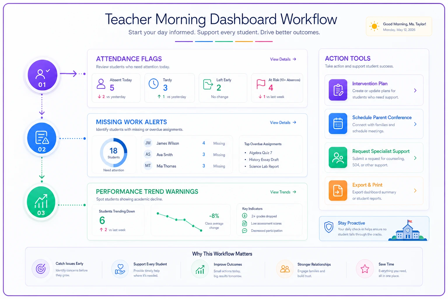
Design the top of teacher dashboards to surface immediate action items—attendance and missing work—so interventions are visible in one glance.
The dashboards should match these rhythms.
The reporting cadence trap that destroys data cultures
Schools love weekly reports. They also love monthly reports. And quarterly reports. And annual reports. The result? Report generation becomes a full-time job while report consumption becomes impossible.
A typical district reporting calendar includes daily attendance reports, discipline logs, and substitute reports. Weekly updates cover grade books, intervention tracking, and parent communication logs. Bi-weekly cycles handle progress reports, IEP reviews, and department meetings. Monthly requirements pile on budget reports, enrollment updates, safety drills, and board packets. Add quarterly state compliance reports, strategic plan updates, and stakeholder surveys. Then annual state testing, audits, accreditation reviews, and climate surveys.
Teachers receive 15-20 different reports per month. Administrators get double that. Nobody reads them all. Most get skimmed for red flags then archived.
These reports don't connect. The attendance report doesn't talk to the grade book. Academic performance doesn't link to behavioral incidents. Financial data lives in a completely different system from student outcomes.
Smart districts implement hierarchy-based reporting cadences. Teachers get push notifications for immediate action items—real-time alerts when students are marked absent from their class, end-of-day missing assignment summaries, weekly dashboard reviews with class performance snapshots, and monthly deep-dives into individual student progress reports.
Administrators receive escalation-based updates. Real-time notifications for safety issues and compliance violations. Daily summaries of operational exceptions that need attention. Weekly operations reviews covering staffing, resources, and program effectiveness. Monthly strategic checks on progress toward department goals.
Board members get scheduled strategic updates—monthly packets with executive summaries and exception reporting, quarterly presentations with deep dives on one strategic priority, and annual comprehensive state of the district reviews.
The principle: push tactical data down, pull strategic insights up. Teachers shouldn't waste time analyzing district trends. Board members shouldn't see individual student data. Each level gets what they need, when they need it, in the format they can act on.
Export templates that turn numbers into narratives
Raw data exports kill decision-making. A CSV file with 10,000 rows of student data helps nobody. Most analytics platforms dump exactly that when users click "export."
Effective exports are pre-formatted for their intended use. Parent Conference Templates include context like "compared to beginning of year" and "relative to grade level expectations," plus narrative prompts for "Areas of growth," "Opportunities for improvement," and "Recommended support at home."
Board Presentation Packets never make board members interpret raw data. They include the headline finding in plain English, supporting visualizations with clear labels, benchmark comparisons for context, and recommended actions or decisions needed.
State Compliance Reports match the exact format the state requires. No manual reformatting. They include validation checks that flag missing or suspicious data before submission and auto-generate narrative sections based on data trends.
Grant Application Support pulls specific metrics that grant applications require, includes historical trends that demonstrate need, calculates improvement projections based on current trajectories, and formats everything to paste directly into application templates.
Teacher Planning Packets group students by intervention need, not alphabetically. They include relevant context like English language learner status or IEP accommodations, suggest evidence-based interventions matched to specific skill gaps, and format for easy printing and classroom use.
Most districts export data then spend hours reformatting it for actual use. That's backwards. The system should know how different stakeholders use data and provide exports formatted for those specific uses.
The unspoken politics of data transparency
Data transparency sounds great until it threatens someone's job, budget, or reputation.
The high school principal who champions data-driven decisions suddenly gets nervous when the data shows their AP program underperforms compared to neighboring schools. The superintendent who demands accountability metrics becomes less enthusiastic when those metrics reveal inequitable resource distribution. The board member pushing for transparency questions whether parents really need access to teacher-level performance data.
These political dynamics shape what gets measured, how it gets reported, and who gets access. The algebra teacher with declining pass rates argues that their students come less prepared than other sections. The elementary school with lower reading scores points to their higher percentage of English language learners. The vocational program with excellent job placement rates still gets cut because college acceptance rates drive rankings.
Successful analytics implementations acknowledge these dynamics upfront by building in context, not just metrics. Don't just show that School A has lower test scores than School B. Include demographic differences, funding disparities, student mobility rates. Context doesn't excuse poor performance, but it prevents misinterpretation and scapegoating.
Create safe spaces for uncomfortable data. Before making data public, give stakeholders time to understand and respond to it. That underperforming department needs a chance to create an improvement plan before the board sees the numbers. Not to hide problems, but to present solutions alongside challenges.
Separate evaluation from improvement. Use different dashboards for accountability versus improvement. Control the narrative layers—data tells stories, but different people need different stories from the same data.
Common implementation failures nobody warns you about
The vendor demo looks amazing. Six months later, the system is an expensive disaster.
Districts often pilot analytics platforms with enthusiastic early adopters, then gradually expand to everyone else. Except "everyone else" didn't ask for this system, doesn't want to change their workflow, and resents the additional reporting burden. By the time the rollout reaches them, the enthusiastic pilot users have moved on to other initiatives, and nobody champions adoption anymore.
Your student information system was built in 2003. Your learning management system came online in 2015. Your assessment platform launched in 2019. Your new analytics platform promises to integrate with all of them. What actually happens: six months of API configuration, data field mapping, and sync errors. Even when it finally works, data updates lag by days or weeks, making real-time dashboards useless for daily decisions.
Districts typically budget for initial training when the platform launches. Three months later, new teachers arrive. Six months later, administrators change roles. A year later, everyone has forgotten the advanced features they learned but never used. Meanwhile, the district can't afford ongoing training, so knowledge gradually degrades until everyone uses maybe 10% of the platform's capabilities.
Who owns the analytics platform? IT thinks it's their system because they manage the servers. Curriculum believes it's theirs because it tracks academic data. Operations claims ownership because they run the reports. The superintendent assumes someone is handling it. Nobody takes real ownership, so nobody drives adoption, nobody ensures data quality, and nobody advocates for improvements.
Building analytics systems that survive leadership changes
The average superintendent tenure is less than three years. Principals last about four years. School board members cycle through every few years. But analytics platforms are five to ten-year investments.
Start with operational embedding, not strategic alignment. New leaders always want to change strategic priorities, but they rarely mess with functional operations that work. If your analytics platform becomes essential for daily operations—taking attendance, tracking assignments, managing interventions—it survives leadership changes. If it only serves strategic planning and board reporting, every new superintendent will want their own system.
Document decision frameworks, not just decisions. When the analytics show chronic absenteeism rising, document why you chose certain interventions, what alternatives you considered, and what metrics you'll track for success. New leaders can change the interventions, but they'll understand the analytical framework behind them.
Create institutional memory in the system itself. Most school knowledge lives in people's heads. When they leave, the knowledge leaves. Build that knowledge into your analytics platform through annotations, historical notes, and context fields.
Design for role continuity, not person continuity. Don't build "Principal Johnson's Dashboard." Build "Principal Dashboard" that any principal can use. Avoid heavy personalization that makes systems unusable when people leave. New administrators should be productive on day one, not spend months reconfiguring everything.
How operational software transforms school analytics
The best school analytics don't come from analytics platforms—they emerge from operational systems that happen to generate data.
When teachers input grades directly into a system that automatically calculates progress toward standards, you get better data than asking them to separately report on standard mastery. When attendance systems automatically trigger intervention workflows, you capture intervention data without additional reporting burden. When parent communication flows through a central platform, you measure engagement without surveys.
Modern AI-powered operational software fundamentally changes the analytics game. Instead of buying separate systems for operations and analytics, schools deploy unified platforms where analytics emerge from operations.
An AI agent monitoring assignment submissions can automatically identify at-risk students without teachers manually flagging them. Natural language processing can analyze parent emails to detect satisfaction trends without formal surveys. Predictive models can forecast enrollment changes based on demographic shifts and historical patterns. The analytics become a byproduct of operational excellence, not an additional burden.
Traditional analytics platforms ask people to input data for reporting. Modern operational platforms capture data through natural workflow, then surface insights automatically. Teachers don't fill out intervention tracking forms—they conduct interventions through the platform, which tracks everything automatically. Administrators don't compile reports—the system generates them from operational data already flowing through.
This shift from "analytics system" to "operational system with analytics" solves the adoption problem. People use operational tools because they need them to do their job. Analytics become a bonus, not a burden. Data quality improves because it's captured at the source, not reconstructed later. Insights arrive in real-time because the system processes operational data continuously, not in batches for reporting.
From data graveyards to decision engines
Most school analytics platforms become expensive data graveyards—storing everything, informing nothing, changing nothing. They fail because they're built backwards, starting with technology instead of stakeholder needs, measuring everything instead of what matters, generating reports instead of driving decisions.
The districts that get analytics right start with stakeholder workflows, not data warehouses. They map who needs what information to make which decisions, then build systems to serve those specific needs. They pick fewer KPIs but ensure they cascade properly through the organization. They match reporting cadences to decision-making rhythms. They format exports for actual use, not raw data dumps.
Most importantly, they recognize that analytics systems are operational tools, not reporting platforms. The best insights emerge from the work itself, not from separate data collection exercises. When analytics become embedded in daily operations—through AI automation that identifies patterns, workflows that capture data naturally, and systems that surface insights automatically—they stop being a burden and start driving improvement.
The principal at Franklin Middle School learned this lesson. After abandoning the $47,000 analytics platform, they implemented an operational management system that teachers actually use for daily work. The analytics emerged naturally. Attendance improved because the system automated follow-up. Grades increased because at-risk students got flagged for intervention automatically. Board reports generated themselves from operational data already in the system.
Nobody talks about their analytics platform anymore. They talk about their operational excellence. That's when you know you've got it right.
Ready to optimize your school operations?
Join hundreds of schools using GoSkoly to save time, improve collaboration, and enhance student outcomes.